Where Wonder Grows by Xelena Gonzalez
Genre: Realistic Fiction
Target age group: Elementary school students around 5 to 9 years old.
Plot summary: Where Wonder Grows by Xelena Gonzalez is a picture book focused on an appreciation of life. Through the stories told by Grandma and the illustrations of the grandchildren delving deep into their imagination, it tries to teach the reader that everything has a story. To interact with these stories, we simply need to listen and observe.
Illustrations:
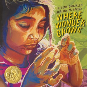
There is a brush stroke aesthetic – it helps create the sense of motion and a freedom of (boundless) imagination. The illustrations of the characters’ facial expressions help carry the sense of motion (Van Gogh-esque). Being right next to Grandma as they tell stories of fascination/wonder with the world.
Each page is filled with vibrant colors mixing together to personify an excitement to learn. The joy of being together with their family seems to illuminate them in warm orange outlines/halos which contrasts the darker blues when they imagine space.
It doesn’t feel like the colors are fighting for control over which is more prominent. Rather they seem to focus on balance. The colors seem to flow together like waves and help give more insight into how each character is feeling/thinking.
Theme
“So when life feels too hard,/ just remember to go with the…/ flow!” (Gonzalez, X., and Garcia, A. p. 26).
There is a power beyond our understanding in nature. The Earth provides many gifts and ways to sustain itself as well as the other creatures that live on it. Though it may take time, water has a way of carving through any challenge. It lets the current take it naturally and will go through the least resistant path. To enjoy life, you need to give up the need to control and come to terms with our limitations.
Pacing/Setting
The entire story feels like one long campfire storytime. There is not much said overall, but the point is to give you the inspiration to look around you and imagine. To leave it up to your perceptions and personal experiences to fill in what is not said, like how the environments shift and shape in the background to show you what their grandmother sees in nature.
There is no such thing as a waste of time as everything works together to create the world we know. As you spend more time awake and aware of the environment, the more that you can learn about the world.
Though the picture book is 40 pages, the narrative and illustrations help to make the readers feel like they have been a part of this ritual of storytelling many times already.
The Truth about Dragons by Julie Leung
Genre: Fable and Fantasy (Mythology); Caldecot Medal Nomination
Target age group: Elementary school students around 4 to 8 years old.
Plot summary: The Truth about Dragons by Julie Leung is a picture book about balance and appreciating the mysteries that nature and the world have to offer. No matter the struggle along the way, there will always be those who will guide and comfort you.
Illustrations:
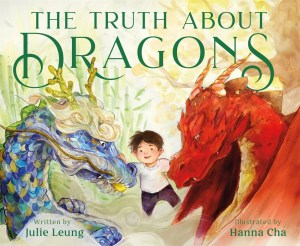
The color of the pages shifts from bright oranges to a navy and violet as the child progresses through their first forest. It helps to show that even through the perspective told by the first grandmother, there is contrast and the inclusion of multiple color themes to show perspective. When the child sees the old woman, she tells him of one truth about dragons. They can be dangerous, but that is not all that they can be.
Theme:
The mother tries to teach their child that they don’t need to limit themselves to one identity, to one culture. Wisdom comes from drawing knowledge from multiple sources, to accept both parts of oneself.
Each grandmother tells a different story about dragons, but neither claims that they know the sole truth about what they are. Dragons do not have just one nature or one purpose. They have the ability to embody multiple things just like humans can, and more specifically what the mother is saying her son can be.
The book seems to use the fable metaphor of dragons to symbolize the Yin and Yang. The fire dragon is first introduced as a destructive and greedy entity, while the second dragon is shown as majestic and essential to life.
Design and Layout:
Once the boy goes on his journey to see his other grandmother, the frames disappear giving the appearance of more room to expand naturally. If the previous forest revolved around strict control, this new forest let nature breathe and brought cohesion between animal spirits and humans.
The bedtime story is told in frames. The backgrounds surrounding the illustrations on each page and the text boxes are in themed frames making it seem like each page is from a photo album.
When the red dragon is introduced, it overwhelms the frames set around the pages. Their massive wings cover the top left of the frame as their fire breath chars the bottom right of the page.
Wonder Walkers by Micha Archer
Genre: Fiction
Target age group: Pre-K to elementary school students around 3 to 7 years old.
Plot summary: Wonder Walkers by Micha Archer begins with two children letting their imaginations run free in an activity called a “Wonder Walk.” They travel around the world to better understand what is in it.
Illustrations:
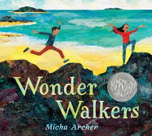
The illustrations help capture the feeling of a world pieced together by a child’s imagination. When it is unburdened with strict rules or expectations, it attempts to create meaning out of the connections we have made, the stories that we listen to. Each page is reminiscent of a painting made entirely from paper mache and thinly cut magazine paper.
Each page has layers and resembles a child’s arts craft. This is seen in the clothes that the children wear, the leaves scattered on the ground, and the sky illuminated above them to just name a few. It is the youthful innocence of discovering more about the world, painted as questions which are left for the readers to find their own meaning.
Design and Layout:
The illustrations extend beyond one page and reach into the next creating the appearance of a giant diorama. It helps to create the sense of scale of just how small they are compared to the environments they explore and how they perceive this difference. The mountains and trees feel as if they are tall enough to reach into the sky. Even the caves, though small, feel like natural treehouses that have mysteries of their own.
Theme:
Wonder Walkers written by Micha Archer is a picture book about curiosity and perspective. Throughout the book, it asks several questions without answering them. The point is less about finding the answer and more about getting the reader to remember what it was like to see the world through childlike imagination. It is the joy of the unknown that helps to reframe everyday places and things like the rolling hills of a mountaintop or the setting of the sun.
New Kid by Jerry Craft
Genre: Realistic Fiction
Target age group: Elementary to Middle schoolers around the age of 8 to 12 years old.
Plot summary: New Kid by Jerry Craft is a Graphic Novel about the struggles to fit in with a new environment, new people, and competing priorities of what it means to live a good life. While adapting to his new surroundings, he encounters racial prejudice and struggles to meet the expectations of competing cultures.
Illustrations:
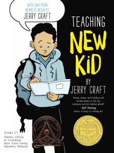
The expressiveness and changing artstyle of the illustrations help support Jordan’s feeling of isolation. They are vibrant with color, often exaggerate expressions and character models to represent what a student was feeling (this mainly focused on Jordan), and do a great job at expressing motion. The main way that the graphic novel handles this is through changing perspective. For example, on pages 102 to 103, the illustrations use perspective and multiple copies of Jordan and his friends to show them gradually walking through a park.
The art style is reminiscent of a mixture of the Big Nate series by Lincoln Peirce and the Diary of a Wimpy Kid series by Jeff Kinney. The main comparisons are from how it explores character actions, body language, and how the illustrations reveal a deeper meaning beyond what was said. One example of this is on page 26 when a student named Maury is called “Maury-o” by sophomore bullies due to him being mixed race. In this moment, the illustration replaces Maury’s face with an oreo that keeps his general facial expressions.
Characters:
Everyone feels distinct. From their introductions, each character has their role shown clearly. Jordan’s mother wants the best for her son, tries her best, but values social and academic prestige over personal wants. Jordan’s father supports his interests and places a greater emphasis on maintaining their culture over conforming to the majority. His father also seems to struggle with connecting to his son emotionally.
The characters felt believable. People in the graphic novel didn’t become friends or enemies because it helped move along the plot. The way they interacted was focused on how their personalities meshed together. For example, Andy (a student at the school Jordan was transferred to) was loud, said what was on his mind without much of a filter, and would reaffirm racial stereotypes of other students. This led to him having very few friends and most of the other students would purposefully avoid him.
The characters’ problems didn’t magically resolve after a single confrontation or story arc. It took time and effort to mend disagreements. Sometimes the conflict was not resolved at all, for example, the difference in opinion for Ms, Rawle and Drew. Ms. Rawle also seems to forget his name and calls him by another student’s name frequently (Deandre) who is another black student.
Despite what they say Ms. Rawle seems to have issues with and calls out cultures that they aren’t familiar with (that’s not white). For example, on page 29, Ms. Rawle doesn’t seem to have any issue with Andy calling his friend “Dawg” but brings this up as a big issue with Drew later on page 89.
Theme:
A main theme of this graphic novel was the struggle to fit in. Jordan was sent to a prestigious and rich school called Riverdale Academy Day school (RAD for short) where he felt completely different from everyone else. At this school, most of the students there are white and come from more privileged families. Jordan experiences a bit of a culture shock which is not helped by Andy who seems to affirm racial stereotypes of other students based on the color of their skin.
As Jordan acclimates more to the environment at his school, his father starts to worry that Jordan is slowly disconnecting with his cultural heritage and doesn’t need him as much anymore. However, his mother encourages Jordan to stay at RAD because she believes it will give him the experience he needs to better navigate his way through finding a well-paying job later in his life. His parents want what is best for his future, but they differ in how they approach this.
On page 166-167, Jordan reveals why he looks up to Batman as a role-model. Batman is able to fit in wherever he goes and always focuses on protecting “the little guys” (pp. 166-167).
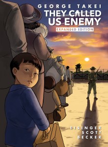
They Called Us Enemy by George Takei
Genre: Autobiographical memoir
Target age group: Pre-teens to teens, Middle to High School students
Plot summary: Where Wonder Grows by Xelena Gonzalez is a picture book focused on an appreciation of life. Through the stories told by Grandma and the illustrations of the grandchildren delving deep into their imagination, it tries to teach the reader that everything has a story. To interact with these stories, we simply need to listen and observe.
Setting
George Takei displays two main perspectives in this Graphic Novel; the innocent recollections of his child self in contrast with the fear and trauma shown by his parents and his future self’s insights reflecting back.
This is shown on pages 38 to 39. George’s father reframes their relocation to a vacation which excites George, but when he looks over at the other side of the train he sees other adults crying. At the time, he didn’t understand why they would be upset by going on a vacation.
As a child, we often think that our parents always know what to do and, as such, are a source of comfort that we depend on for any issue. That is partially true, but oftentimes parents would be lost and more emotionally scarred without their child’s or children’s youthful optimism.
The story is set in the 1940s, right after the bombing of Pearl Harbor.
Style and Language/Pacing:
At times, Takei is seen attending conferences as a much older man to talk about his experiences in the internment camps. After a couple of pages, it will then shift back to his younger self, still learning the lessons he is advocating for.
The memoir bounces around in time to help support the message and situations shown in the story. This shifting of perspectives is reminiscent of the butterfly effect where any action or decision you make creates ripples in time. To put it a simpler way, there are always consequences for decisions and actions taken, although they may not always happen immediately.
Illustrations:
The slight cartoonish style of the graphic novel could then be a visual representation of how George Takei processed the trauma of his childhood in the internment camps.
The illustrations in this graphic novel are drawn in black and white, and have a very clean, hand-drawn aesthetic. As such, this style feels more like watching a memory through a childlike lens. For example, on pages 44 to 45, the narrative highlights the difference between how he perceived his father, as a man always in control, versus the panic that he didn’t let George or his younger siblings see. We only see George’s thoughts, but when his father turns away to look at the surrounding environment, we, the readers, can see the worry in his father’s expression.
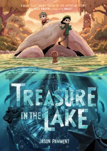
Treasure in the Lake by Jason Pamment
Genre: Fantasy and Mystery
Target age group: Elementary and middle school students around 8 to 12 years old.
Plot summary: Two childhood friends, Sam and Iris, grew up in a small town called Bugden and enjoyed going on adventures to find old trinkets. One day when they’re exploring, they find an abandoned town and begin to uncover more about its history.
Illustrations:
The illustrations do a good job at showing motion. If I look through the panels fast enough, there are times when they resemble a stop-motion animation. One example of this is on page 13, as a small wooden object floats down a river, hitting multiple rocks and objects along the way.
The illustrations for the characters are very emotive as well. Though, their reactions or facial expressions don’t stretch beyond the bounds of realism.
Tension:
The main tension in the story is between the two main characters, Sam and Iris, who disagree on what they want out of their lives. Sam is fine with living in Bugden and keeping to what is familiar. However, Iris wants to explore the world and escape Bugden, which she views as a prison. More often than not, Iris ends up strong-arming Sam into going on short adventures away from home.
Iris’s resentments build up gradually as her attempts to find a way out of this city seem to keep failing. The last straw for Iris is when they find an abandoned city and Sam wants to go back home rather than keep exploring. On page 73-76, they begin to argue over their perspectives. Eventually, they decide to separate and do what they want to. They are able to throw away their differences, however, once a new threat is presented in the story: the abandoned town begins to flood.
Theme:
The central theme of this story focuses on the power of connections. Despite leaving on bad terms, when someone is in danger, the people that know and care about them will show up for each other again when it matters. This is shown twice near the end of the graphic novel. The first time this is shown is on page 127. Benjamin, an older man who lives close to the abandoned town, tells Sam the story of how the town was originally evacuated due to a sudden flood. Despite Benjamin ending on poor terms with his friend (who later on became his wife), he went back into the town to help save her. The same sort of situation happens when Sam rushes back into the town as it is flooding to help save Iris on page 140.
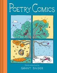
Poetry Comics by Grant Snider
Genre: Poetry
Target age group: Elementary to Middle school students around 8 to 12 years old.
Plot summary: This collection of poems focus on giving life advice on how to discover more about yourself and inspire readers to try new things.
Illustrations:
The illustrations resemble the art style used in Roald Dahl’s book cover art of Witches. They have a pencil sketch quality which looks as if it was colored in with a mixture of markers and colored pencils.
One of my favorite aspects of this book is that the poetry and the illustrations have enough detail and context to work independently of each other. On page 23, the young girl in a red shirt is holding onto a balloon which flies out of their hand. From small details like their panicked and shocked facial expression or their slumped over body language, it’s easy to understand how distraught the character is in this moment.
Design and Layout:
For each poem, the illustrations take on a slightly different style to help visualize the meaning behind the poem. The poem titled, “If I Were a Tree” shows a large tree growing through each of the panels where each panel shows a different point in time. Another example is with the poem called “Roller Coaster.” On page 40, the illustrations and the poem itself take on the theme of a ferris wheel by having no clear place where it starts or ends. Even the text in the poem remains in all lowercase to help support this idea.
Theme:
The poems balance between teaching lessons, about appreciating life more and inspiring readers to try new things, and making it visually appealing for a younger audience. For example, the poem called, “Cloudspotting” which shows several clouds in the sky taking on the shape of an animal or an object. There is one cloud, however, that stays in the shape of a cloud the entire time. The poem says, “Every cloud trying to be something else / except one / proud to be itself” (p. 36). I interpret this to mean you don’t need to be ashamed of who you are, and don’t try to force yourself to change in order to better fit what someone else wants you to be.
The main focus in Snider’s book is on finding what you’re passionate about and being comfortable in your own skin.
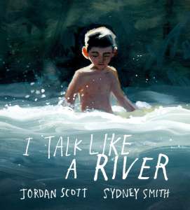
I Talk Like a River by Jordan Scott
Genre: Disabilities and Differences, Realistic Fiction
Target age group: Pre-K to elementary school students around 4 to 8 years old.
Plot summary: I talk like a River by Jordan Scott is a story about
Illustrations:
The illustrations tend to stretch to both sides of the page and help emphasize how Jordan’s feeling at the moment. Whether, for example, they feel isolated and sad at home or dread when they’re the center of attention in class.
On the first two pages, the illustrations focus on a single object at a time but include a lot of empty space around them. It also breaks a sentence into 4 segments which is meant to be read horizontally from the top half of both pages and then the bottom half. Though, the picture book is organized to still make sense if the reader prefers to read each page individually.
When Jordan is called to speak in class on page 9 and 10, the illustrations of the other students, the teacher, and the classroom become smudgy, out of focus, and distorted.
The only character who is drawn with facial expressions is the main character, Jordan. The main focal points are usually his eyes which look in the direction of the readers.
Theme
One of the central themes of this graphic novel is the feeling of isolation that can come from being different or disabled. It shows the journey of a young boy who learns that he doesn’t need to be embarrassed to have a stutter. Even nature and its rivers stutter as they move.
Characters:
How does someone support a child with a disability or who is different from everyone else? Jordan’s father approaches this question by bringing him to a space where Jordan feels more comfortable and by reframing the perception of his stutter by comparing it to a river. Doing this helped Jordan not feel so alone as even nature stutters as it flows from one area to another, through uneven ground and large rocks.
The other characters shown in the story are from his school, the other students and his teacher. The students act as an antagonistic force as they focus more on ridiculing him for speaking differently. Despite struggling with his stutter, it doesn’t seem like the teacher offers any alternative for him to help accommodate him when he has to speak in front of the class.
Jordan is depicted as a timid child who, through negative reinforcement in social interactions with his stutter, does his best to not be noticed or be put in situations where he has to talk.
Inside Cat by Brendan Wenzel
Genre: Fiction and Poetry.
Target age group: Pre-K to elementary school students around 3 to 5 years old.
Plot summary: A cat named “Inside Cat” wanders around their home and watches a number of strange things and creatures outside the windows.
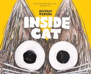
Illustrations:
The illustrations align with the cadence of the text, where each sentence shows the Inside Cat looking at different things and moving through the various rooms in their house. These rooms use perspective to make the home seem to stretch on endlessly, such as on page 18, where the building looks like a surrealist painting with parts of the outside brick wall hovering over a large gap in the floor. To show motion, the illustrations often depict multiple versions of Inside Cat looking through every window in a room simultaneously.
The style itself looks like a mixture of a pencil sketch and a painting, and the illustrations are often drawn around the windows to show a continuation of what Inside Cat sees outside. For example, on page 23, as a train passes by, the art shows the rest of the train cars with legs and a large smiling face on the front. Throughout these scenes, Inside Cat’s body language, the shape of their eyes, and their facial expressions effectively show how they’re feeling and reacting to the outside world.
Style and Language:
The text provides a simplistic rhyme and meter for its sentences. It frequently returns to a chorus-like set of lines which are, “Inside Cat knows many windows, find a view wherever it goes. / Wanders. / Wonders” (pp. 15, 18, and 21).
It usually keeps to an “AA, BB” rhyming structure and writes the sentences in easy to understand words. It usually keeps each line to be around 3 to 4 syllables.
Design and Layout:
If the book shows the perspective of Inside Cat, it appears that the outside world has an endless array of scenery and creatures. It’s almost like living in a flying horse or a submarine that travels from one part of the world to the other. At times, they are surrounded by a river or a flock of birds while at other points it seems like they are in a dark fantasy world.
Aside from Inside Cat, everything else in the house seems to be vague outlines of objects without colorful shadings. It takes on a majority of blue colors. This could show how Inside Cat views everything in the house to be boring or uninteresting; the true excitement lies outside. This is reinforced by the colorful shadings of the brick wall that is shown when Inside Cat looks outside toward the readers.
Sorceline by Sylvia Douyé
Genre: Fantasy and Mystery
Target age group: Elementary school students around 9 to 12 years old.
Plot summary: Sorceline is brought into a fantastical world full of cryptids to study under a famous cryptozoologist, Archibald Balzar, in hopes of being his assistant. However, she has to compete with five other students who want the same thing all the while odd events occur that threaten their safety.
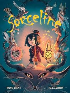
Illustrations:
The illustrations use clever visual cues to tell the story beyond the dialogue. One small but effective detail is how the text bubbles change; when a character is thinking or remembering something, the bubble becomes a rectangle instead of a circle. You can also see small lines above a character’s face to show surprise or most animated reactions. A standout moment is on page 71, where the usual panel designs are removed and replaced with long growing branches to show the scale of the forest. The art also uses color to set the mood, such as on pages 82 and 83 where the background shifts from bright orange to deep violet, visually showing the time passing and the growing divide between the characters.
Tensions:
One of the main conflicts of the story is between the characters, as they compete with each other to be chosen as Archibald Balzar’s new assistant. The structure of this apprenticeship is a competitive school environment where the student who can identify, problem solve, and care for cryptids the best will win. As such, the students attempt to trick or take advantage of everyone else to get them a better advantage themselves. The most obvious of which is Tara listening to what Sorceline says and taking credit for it. On page 11, this is the first instance where Tara listens to what Sorceline said and says it louder so Balzar hears her instead.
As the story progresses, the conflict shifts from competitions among the students to a fight against the supernatural. At first, it begins with pixies acting weirdly and develops into some of the students and other creatures on the isle of Vorn turning into glass. Due to this threat, the remaining students put aside their differences and work with Archibald Balzar to solve this mystery.
Characters:
The Graphic Novel doesn’t introduce the characters at the beginning of the story. Instead, the story relies on characters explicitly saying their name in conversation to know who they are. As of page 13, only Sorceline, Tara, and Archibald Balzar have been named.
Sorceline acts as the protagonist of the story
The graphic novel takes an interesting approach by not introducing the characters at the start. Instead, you only learn their names when they are explicitly said in conversation, which makes the introductions feel more natural. By page 13, only Sorceline, Tara, and Archibald Balzar have been named. The cast is defined by their roles in the competition: while Sorceline is the intuitive lead, Tara acts as a foil who constantly steals Sorceline’s credit to secure her own spot on the island. Other characters like Willa, a headstrong girl who isn’t afraid to accuse professors, and Alcide, who makes it clear he has a crush on Sorceline, round out the group. Even the loner, Merode, fits a specific “goth” aesthetic that adds to the mystery of who can really be trusted.
